Implementing Dark Mode in React: Enhance User Experience
Toggle the button to switch between 🌗 mode in an easy way 🔥


The dark mode is a design trend that has become increasingly popular over the past few years. Websites have dark mode because it offers several benefits to users, such as:
- Reduced Eye Strain: White backgrounds can cause eye fatigue and discomfort, particularly in low-light situations. Dark mode utilizes low-light emitting pixels resulting in reduced strain on the eyes.
- Improved Readability: Text in dark mode appears more prominent due to less intense background light. This enhances the focus on the content of the webpage making it easier to read.
- Battery Saving: Devices with OLED screens save the battery when running on dark mode upon displaying darker colours.
- Better Aesthetics: Dark mode interfaces are often regarded as being sleeker and modern, affording an aesthetically pleasing feel to the interface.
Overall, offering a Dark mode to users enhances user experience by reducing eye strain, increasing readability in low-light environments, saving device battery, and providing a visually appealing aesthetic experience.
This article explains how to add dark mode to a React app without much effort.
Setup
Before starting the tutorial, we need to set up a new create-react app for us to work on. In this tutorial, we will be using Semantic UI’s official integration over React for creating components.
npx create-react-app tut-react-dark-mode
cd tut-react-dark-mode
The boilerplate application by React uses dark colours. Modify the .App-header class in src/App.css to make it light.

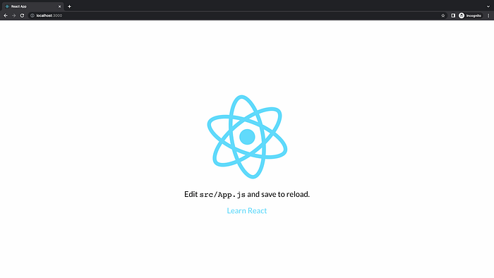
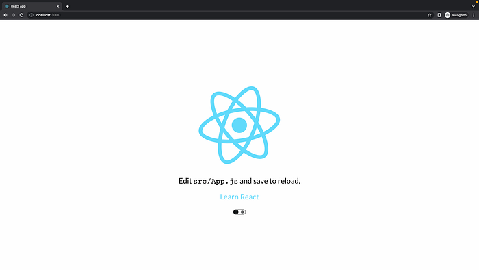
Now start the react app
$ npm run startIn the browser, you should see like,

Setup Semantic UI
Now, we are ready with an app it's time to add the toggle button to our web app. Let's use the Semantic UI React package to do the same.
$ npm install semantic-ui-react semantic-ui-css --saveImport the semantic UI style file (semantic-ui-css/semantic.min.css) in our application entry point,

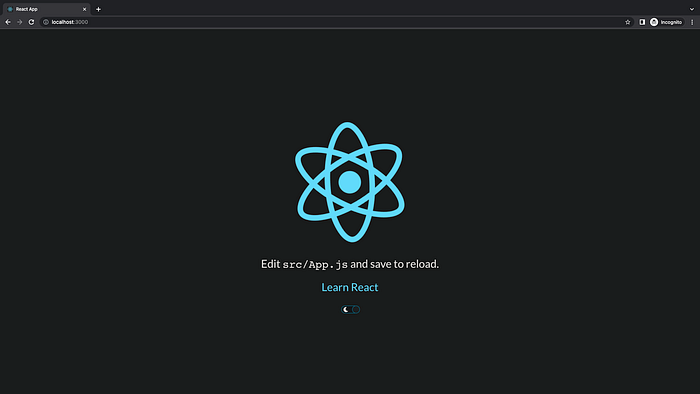
Now your website looks something like the below, There will be a slight change to the font due to the Semantic UI.
Setup dark reader
Dark Reader is an open-source MIT-licensed browser extension designed to analyse web pages. Dark Reader will generate a dark mode that aims to reduce the eyestrain of the user. Dark Reader is feature-rich and customisable in many ways throughout the UI.
For your use case, we will be installing their package from NPM,
$ npm install darkreader --saveCreate toggle component
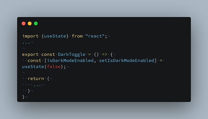
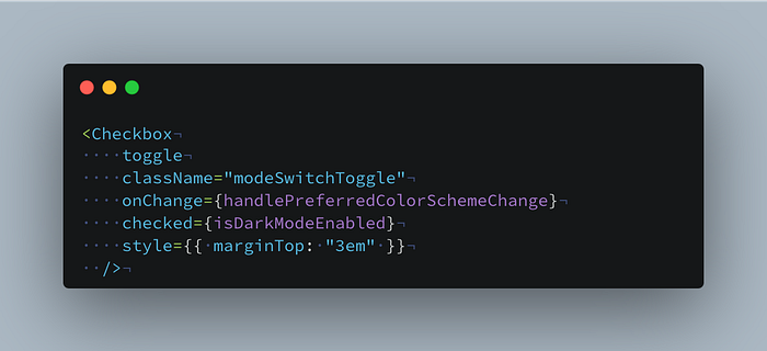
Let’s use the Checkbox component from the Semantic UI and create a toggle (src/DarkToggle.js) button.

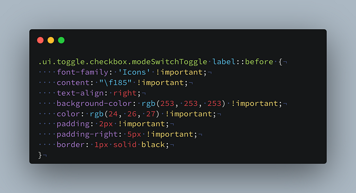
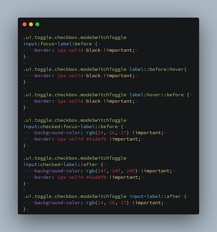
Create styles (src/DarkToggle.css) to make the toggle as shown in the thumbnail.

Insert the DarkToggle component into the App component,
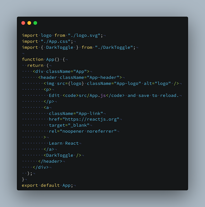
App looks something like this,
Implement switching to the dark mode
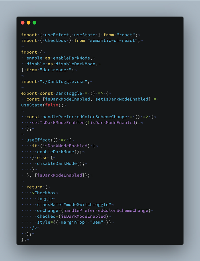
Create a React state that gives true if dark mode is enabled, by default it will be false indicating light mode.
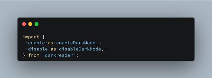
The dark reader NPM package exports 2 functions {enable, disable} that modify the light colours in the website dark.
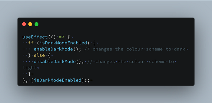
Use the useEffect hook and trigger them when isDarkModeEnabled changes.
An effect hook to enable or disable dark mode when the state changes.
There is another function {auto} exported by the dark reader, this changes the colour scheme based on system preference.
A handler to update the previously created state when onChange is triggered on toggle button.

Merging all the pieces will give something like,
It's time to toggle the colour scheme to dark, click the toggle on the website and look for the magic 🪄
The fully completed source code is available for reference at https://github.com/satheesh1997/tut-react-dark-mode and the functional app is available at https://tut-react-dark.satheesh.dev/.
By default its light mode, but if you want to use the system preferred colour scheme set the default state value as

Hope you ❤️ this, See you in the next tutorial 👋.
